Last month, I heard a fascinating episode of The Leonard Lopate Show about what we “see” when we read. The guest was Peter Mendelsund, whose primary occupation is that of a book cover designer. You can listen to the segment here:
August was a busy month for Mendelsund. Not only did he publish the aforementioned What We See When We Read, bur also Cover, about the creative process and all the thinking that goes into coming up with the most appropriate book art.
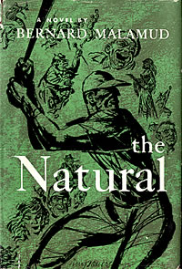
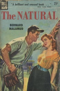
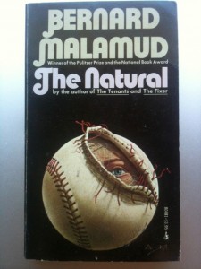
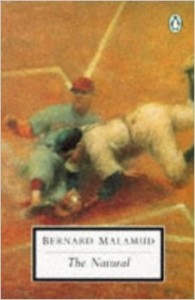
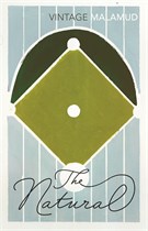
Bernard Malamud’s classic novel of fall and redemption has been around since 1952. Over the decades, it has been wrapped by a number of wildly varying covers. I wonder how the discussions went for some of those designs?
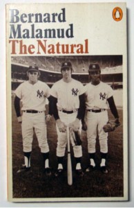
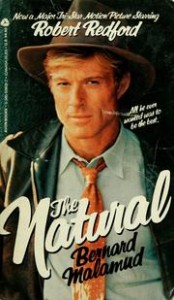
I tried put these covers in guestimated order of publishing (except for the Robert Redford movie tie-in). If anyone has specific information abut the various editions, please let me know.
 |  |
 |  |
 |  |
 |  |
 |  |
 |  |
 |  |
Just a few observations:
- Some of the covers are downright dull, leaving me to wonder what the book might be about (in particular the “pinstriped” version with the script font). But the Dell paperback is just the kind of pulp design we’ve come to love from that era, full of sexual tension in a PG-13 manner.
- I know I’ve seen that drawing of the runner sliding into home plate before, but can’t recall the details.
- The Yankee on the left of the cover is Ron Blomberg but who are the other two? I’m wondering if that’s Bernie Allen on the right.
- The book on the left of the middle row strikes me as coming from the late-60s, early-70s, with a kind of psychedelic/horror flavor.
- The book on the right of the next-to-last row was published in England; the one on the left of the bottom row, Australia.
Judging a book by its cover: The Natural
No comments:
Post a Comment